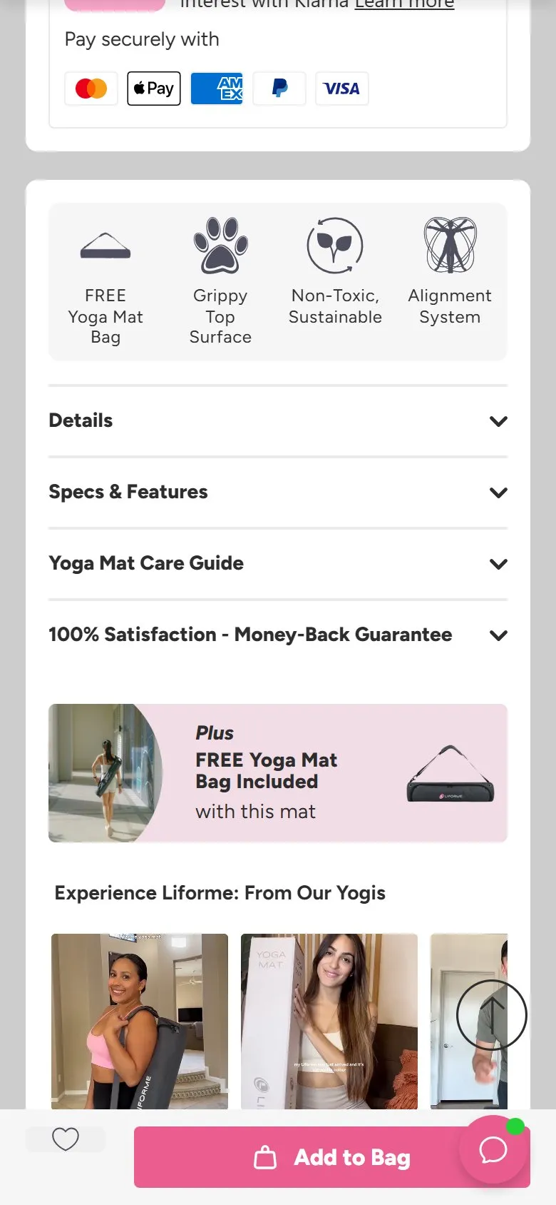
Icons summarising the key benefits under the add to basket
What they do
Under the buy box, a compact icon row states the product's headline claims visually: FREE Yoga Mat Bag, Grippy Top Surface, Non-Toxic & Sustainable, Alignment System. Above it, a tick-list handles the retail reassurances (free 1-2 day delivery, 30-day money-back, shipped from the UK).
Why it works
A scanning shopper gets the four reasons to buy in about a second, without reading a paragraph. Icons + three-word labels are the most information-dense format on the page, and separating product benefits (grip, materials) from purchase reassurances (delivery, returns) keeps both lists sharp. Each callout is then expanded properly further down the page, so the icons work as a contents list for the long-form sections.
Makes sense when
Every product page, honestly. The discipline is the hard bit: exactly the three to five claims that differentiate the product, phrased in plain words, each backed up somewhere below rather than left as an assertion.
More like this
More product patterns
Want this on your store?
I'll tell you which of these patterns will move organic revenue for your catalogue, and which to skip.
Book a discovery call