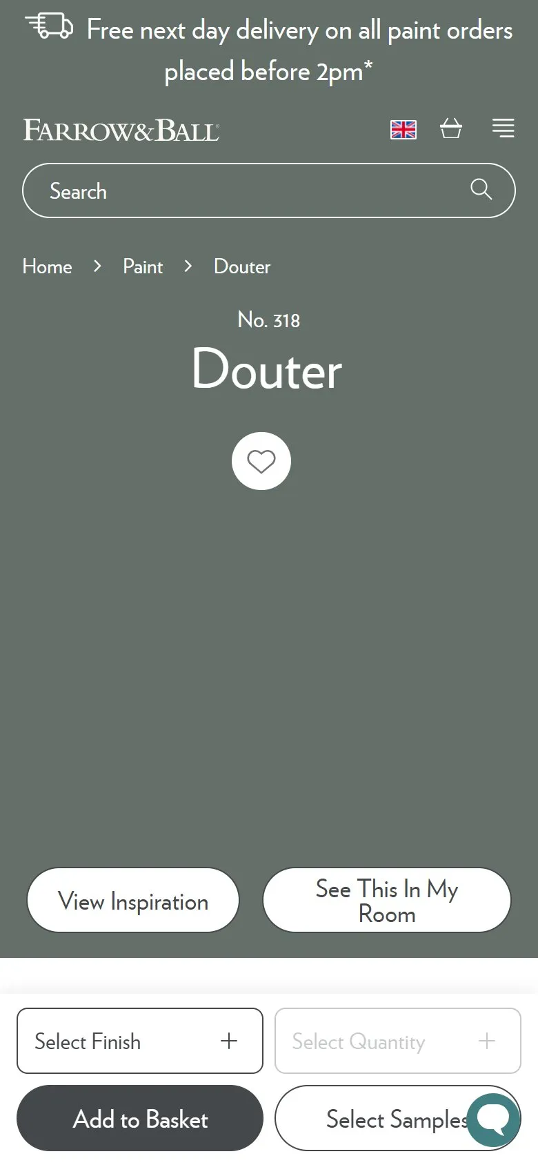
A product page header that repaints itself in the colour you've selected
What they do
The top third of the product page is filled with the colour itself rather than a photograph of a tin. On Douter that block is #636F68, a smoky grey-green, carrying the name, the number, the wishlist heart and the order panel. Load Nancy's Blushes and the same block is #E6B7BA. The container also swaps a light-theme class for dark-theme, which flips the type from white to near-black so it stays readable on a pale pink, and the delivery strip below it takes the colour too.
Why it works
On a paint page the colour is the product, so a tin shot is a picture of the packaging rather than the thing being bought. Filling the viewport with a flat field of the shade gives the shopper the largest sample any screen can offer, which is exactly the judgement they're trying to make. The theme flip is the part most builds would skip and the part that makes it work, because the same treatment has to hold on Railings and on Setting Plaster. It also gives roughly a hundred and thirty near-identical templates a distinct identity, so a page shared or revisited is recognisable before a word is read.
Makes sense when
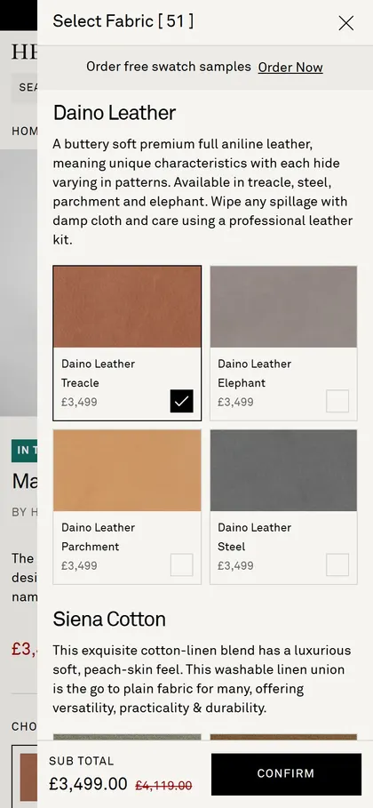
The variant a shopper picks is itself an appearance, which covers paint, tiles, flooring, worktops, fabric and laminates. On Shopify it's a hex in a metafield driving a section background, plus a luminance check to decide whether the text goes white or black. It's the wrong move where a photograph of the product in use does more selling than the swatch.
More like this
More product patterns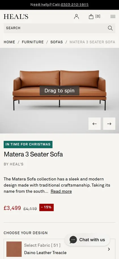
Want this on your store?
I'll tell you which of these patterns will move organic revenue for your catalogue, and which to skip.
Book a discovery call