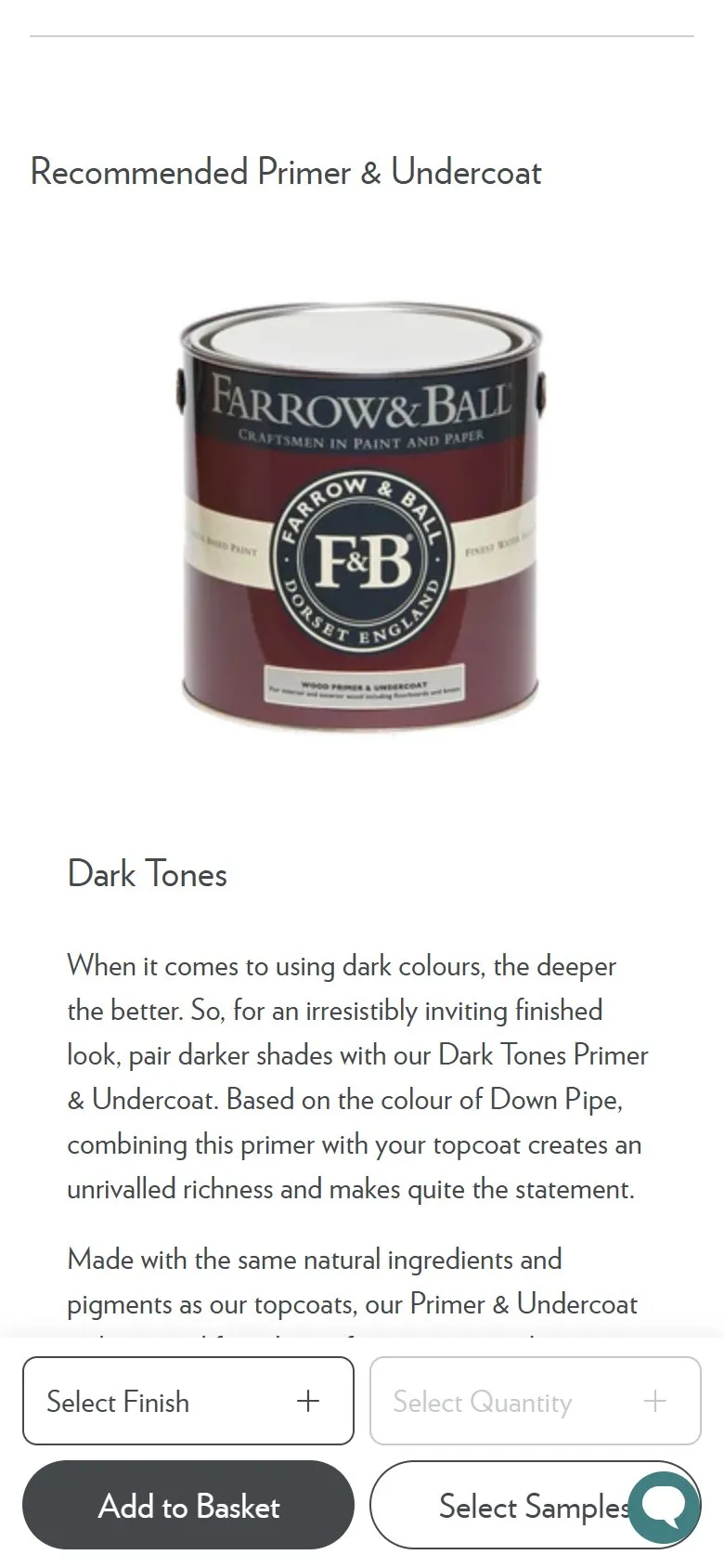
An upsell matched to the product, with the reason explained
What they do
The description block names the primer for this specific colour ("Recommended Primer & Undercoat: Dark Tones"), and a section further down gives that primer a photograph, a paragraph and a route to buy. The recommendation moves with the shade: Douter is sent to Dark Tones, Nancy's Blushes to White and Light Tones. The copy explains why rather than asserting it, noting that Dark Tones is based on the colour of Down Pipe and that combining it with a dark topcoat is what creates the depth. Underneath sit the three surface-specific primers, Wall & Ceiling, Wood and Metal, so the shopper picks tone first and surface second.
Why it works
Primer is the accessory nobody enjoys choosing and plenty of buyers skip, which produces a patchy finish and a customer who blames the paint. Making the choice for them protects the result the brand is judged on and adds a second tin to an order that was already £81 for 2.5 litres, so the basket effect is real rather than pennies. Splitting the decision into tone then surface is the detail worth copying, because a shopper asked to choose from a wall of primers usually chooses none.
Makes sense when
The product needs preparation or consumables to perform, and getting that wrong looks like a fault in the main product. Think paint, wood treatments, adhesives for flooring and tiling, or care kits for leather and stone. It needs a rule that maps each product to its accessory, not a manual pick per line, or it'll rot the first time the range changes.
More like this
More product patterns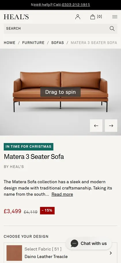
Want this on your store?
I'll tell you which of these patterns will move organic revenue for your catalogue, and which to skip.
Book a discovery call