Collection links by customer goal, not product type
What they do
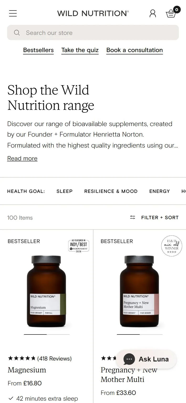
The all-supplements collection opens with a short H1, "Shop the Wild Nutrition range", and two lines of intro about the founder, Henrietta Norton, and their Food-Grown® process, with a "Read more" link that expands the rest. Straight under it is a row labelled "Health goal:" with eleven links: Sleep, Resilience & Mood, Energy, Hormones, Pregnancy, Fertility, Gut Health, Brain Health, Immunity, Skin Hair Nails, and Weight Management. Each is a real link to its own collection (Sleep goes to /collections/sleep-supplements, Fertility to /collections/fertility-supplements). The grid starts right after.
Why it works
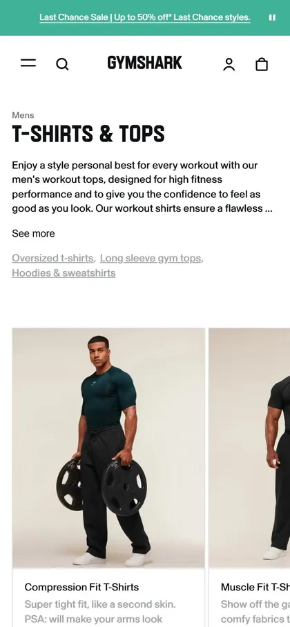
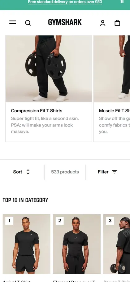
The quick links are where most stores put product type or price. Wild Nutrition use them for the question the customer is actually asking, so someone scanning around 100 products can narrow to their problem in one click. For search, it's a row of crawlable internal links from the top of the main collection to the goal collections, which are the pages that match how people search ("supplements for sleep", not "magnesium glycinate capsules"). The Read more keeps the intro copy on the page without pushing the products below the fold, the same trade-off as the Gymshark top-copy toggle on this board.
Makes sense when
Any range where customers shop by need: supplements, skincare, pet health, gardening. Each goal link needs a proper collection behind it with its own copy, otherwise you're linking to thin pages.
More like this
More collection patterns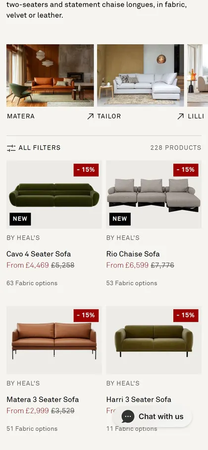
Want this on your store?
I'll tell you which of these patterns will move organic revenue for your catalogue, and which to skip.
Book a discovery call