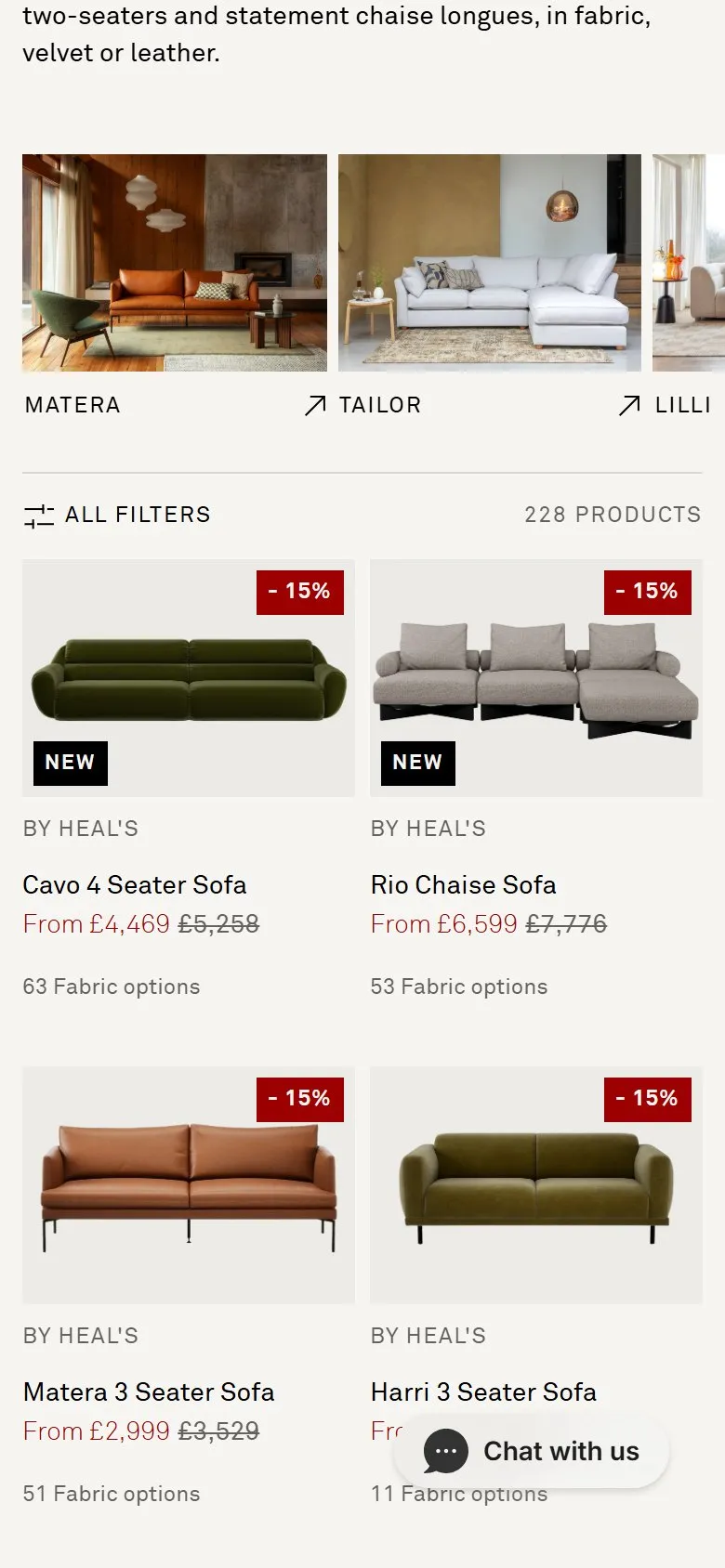
An image carousel of product ranges above the grid
What they do
Between the intro copy and the filter bar sits a horizontal carousel of ten sofa ranges: Matera, Tailor, Lilli, Rafi, Hepburn, Harri, Eton, Devon, Torino, Astrid. Each card is a full room-set photograph with the range name and an outbound arrow underneath, and each links to that range's own collection page rather than to a filtered view of this one.
Why it works
Browsing 246 sofas is a chore; choosing a range is a decision. The room sets do the work a product cutout can't, showing scale, styling and the kind of home the sofa belongs in, so a shopper self-selects on taste before they ever touch a filter. The SEO half is a hub and spoke: the strongest page in the category passes links to ten range collections that would otherwise sit three clicks down, and those range pages are the ones that rank for brand-plus-model searches.
Makes sense when
Catalogues where products cluster into named families, ranges or collections, and where you have or can commission in-situ photography. Cutouts on a plain background kill it, because the whole point is the room. If ranges only exist as a filter value rather than a real URL, build the collection pages first.
More like this
More collection patterns

Want this on your store?
I'll tell you which of these patterns will move organic revenue for your catalogue, and which to skip.
Book a discovery call