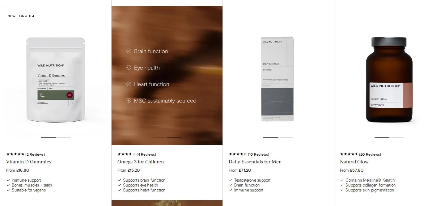
Product card hover images that list the benefits
What they do
91 of the 99 product cards in the collection carry a second image, and it isn't a back-of-pack shot. It's a blurred colour field with four lines of white text. Hover over Omega 3 for Children and the jar is replaced with: Brain function, Eye health, Heart function, MSC sustainably sourced. Magnesium becomes: 42 minutes extra sleep, Nervous system support, Reduction of fatigue, Scientifically studied. On mobile the same image sits second in a swipeable gallery on each card.
Why it works
Every product in the range comes in the same amber jar with the same label layout, so the main image can't tell one product from another. The hover makes the second image do the selling: it answers "what's this one for?" without a click to the product page, in a format that can be scanned across a whole row. The benefit lines also sit as text under each card's price, so the information isn't locked inside an image that search engines and screen readers can't read.
Makes sense when
Catalogues where the packaging is uniform and the difference is invisible: supplements, candles, coffee bags, paint tins, skincare in matching bottles. It needs one template applied across the range, or the grid looks messy on hover. Keep the same benefits in the card text too.
More like this
More collection patterns
Want this on your store?
I'll tell you which of these patterns will move organic revenue for your catalogue, and which to skip.
Book a discovery call