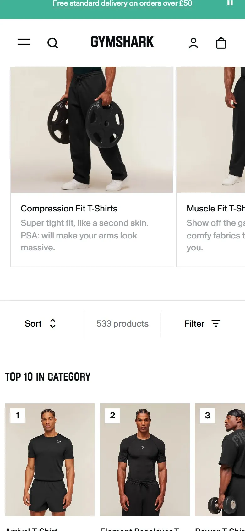
Image cards linking to sub-categories above the product grid
What they do
Between the intro copy and the product grid runs a carousel of image cards, one per sub-collection: Compression Fit, Muscle Fit, Tank Tops, Short Sleeve Tops, Oversized Fit, Long Sleeve, Graphic Tops, Stringers. Each card carries a model shot, the sub-category name and a one-line description ("Super tight fit, like a second skin...").
Why it works
A shopper who searched "gym t-shirts" often actually wants something narrower, and the cards let them self-segment in one tap instead of scrolling 374 products. That's decision fatigue dealt with at the top of the funnel. The same links are also crawlable internal links to the sub-collections, so the visual navigation and the SEO link architecture are one element doing both jobs, reinforced by the text links in the intro copy above.
Makes sense when
Any broad collection with meaningful sub-collections and the imagery to tell them apart at a glance. Needs real differences between sub-categories; eight cards of near-identical products would add friction rather than remove it.
More like this
More collection patterns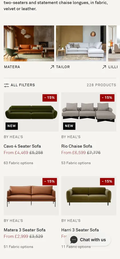

Want this on your store?
I'll tell you which of these patterns will move organic revenue for your catalogue, and which to skip.
Book a discovery call