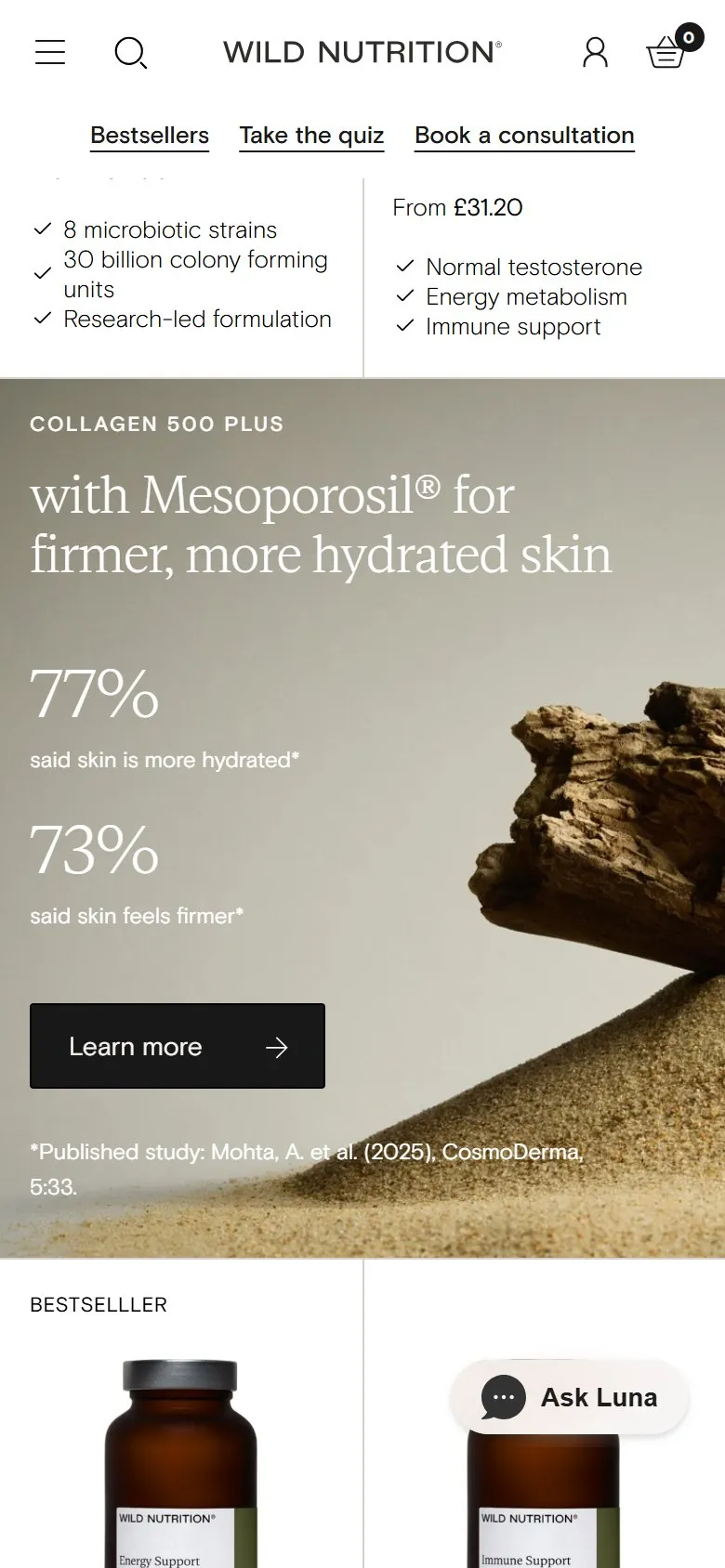
Stats, a quiz and expert picks as tiles inside the product grid
What they do
Page one of the collection has five tiles in the grid that aren't products. A Collagen 500 Plus panel: "with Mesoporosil® for firmer, more hydrated skin", 77% said skin is more hydrated, 73% said it feels firmer, with the study cited underneath (Mohta, A. et al. (2025), CosmoDerma). A "Feeling exhausted? Take the quiz" tile for the 60-second quiz. A High Fibre Plus new-arrival tile. A Night Time Duo expert pick, with a quote from Isabelle Nunn and its own "+Add" button. And a Magnesium panel: "42 minutes extra sleep" and "32% increase in sleep quality", again with the published study named.
Why it works
This is the Learn section brought into the shop, at the moment the customer is comparing products. The numbers give a reason to pick one jar over another in a grid where every jar looks the same, and the citations make them believable. The quiz tile catches the browser who's scrolling because they don't know what they need. None of it sends the customer off to a blog post to find the evidence, which is where most brands leave it.
Makes sense when
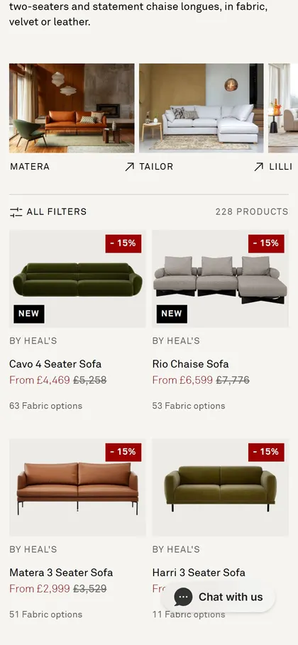
Any grid where products look alike and the difference is in what they do. Keep it to a handful of tiles spread through the page, or it reads as an ad break (Heal's does the same with its free swatch tile). Every stat needs a source you'd be happy for a customer to check.
More like this
More collection patterns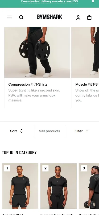
Want this on your store?
I'll tell you which of these patterns will move organic revenue for your catalogue, and which to skip.
Book a discovery call