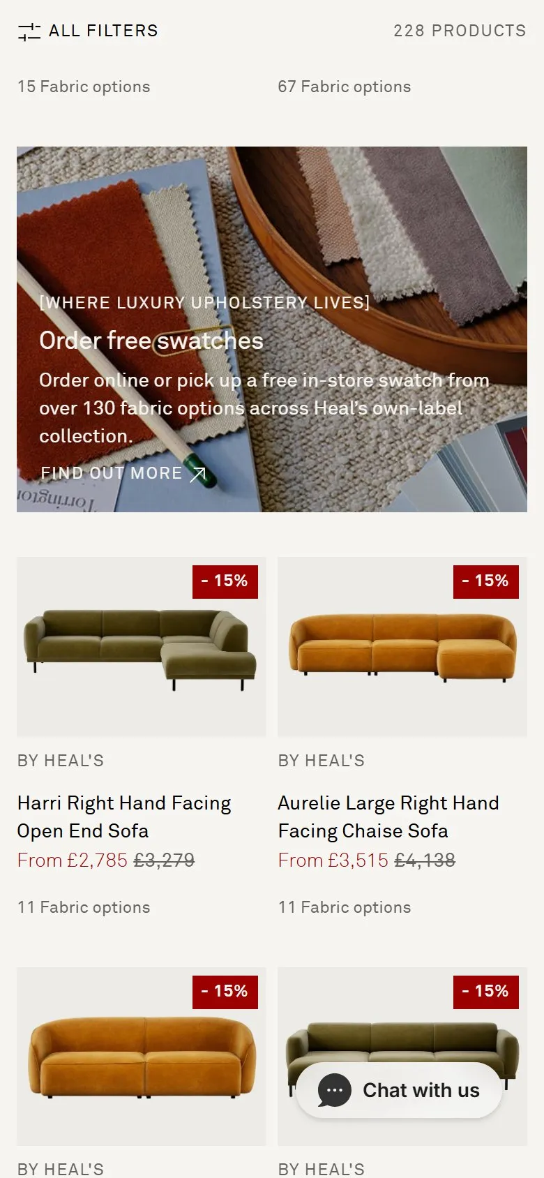
A free samples offer shown as a tile in the product grid
What they do
Three tiles in the sofa grid aren't products. They sit at positions 7, 16 and 29, each spanning two of the four desktop columns, and they run in a deliberate order: a Sofa Buying Guide, then "[Where luxury upholstery lives] / Order free swatches / Order online or pick up a free in-store swatch from over 130 fabric options across Heal's own-label collection", then interest-free finance with V12. The swatch tile carries a styled photograph of fabric samples fanned on a tray. The same swatch offer reappears at the top of the fabric drawer on the product page, as "Order free swatch samples / Order Now".
Why it works
Read the three tiles in order and they're a funnel, not a set of ads: help me choose, let me see the colour, let me afford it. Each one answers the objection a shopper hits at roughly that depth of scroll, which is why they're spaced rather than stacked. The swatch tile is the one doing the heavy lifting, because nobody spends four thousand pounds on a colour they've only seen on a screen, and the swatch request is the real conversion event on a sofa category with the sale second. Putting it inside the grid rather than in a banner means it arrives whilst the shopper is already comparing colours, which is the exact moment the doubt lands, and the photograph sells the swatch pack as an object rather than a form.
Makes sense when
Any considered purchase where material, colour, fit or price is the thing stopping the order: upholstery, paint, flooring, tiles, worktops, made-to-measure anything. Copy the sequencing as much as the tile, because three tiles selling the same thing would read as an ad break. It needs a genuinely free sample with fulfilment behind it, and each tile has to look like editorial or it gets scrolled past with the banners.
More like this
More collection patterns

Want this on your store?
I'll tell you which of these patterns will move organic revenue for your catalogue, and which to skip.
Book a discovery call