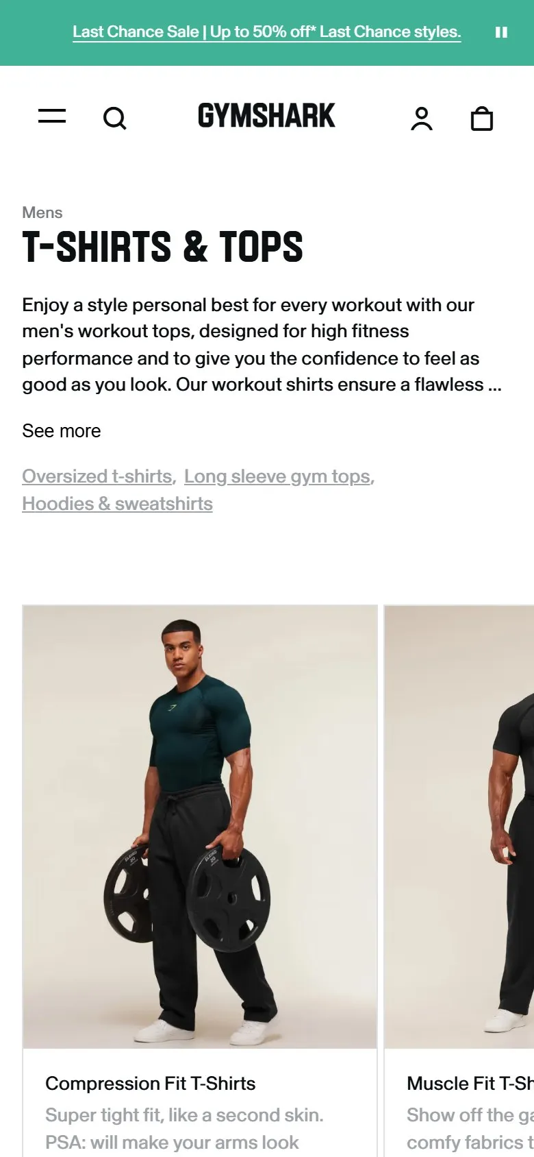
Short intro copy with a See more toggle and related links
What they do
The collection opens with a short block of descriptive copy under the H1 ("T-SHIRTS & TOPS", 374 products), truncated after about three lines with a See more toggle. Expanded, it's still only a paragraph, and a See less control puts it away again. Directly beneath sit plain text links to related collections: Oversized t-shirts, Long sleeve gym tops, Hoodies & sweatshirts.
Why it works
The copy gives Google context for the collection without pushing products below the fold, which is the usual objection to category copy, and the toggle is what makes that trade-off work on mobile. The related-collection text links pass relevance to sibling collections and catch shoppers who've landed one level too broad or too narrow. It's the tidiest answer to "where do you put the SEO copy?" on a collection page: at the top, but collapsed.
Makes sense when
Any collection page carrying keyword-targeted copy. The toggle matters most on mobile where three lines of copy is the ceiling before it costs you product visibility. Keep the expanded version genuinely useful rather than keyword soup, and put the related-collection links right under it.
More like this
More collection patterns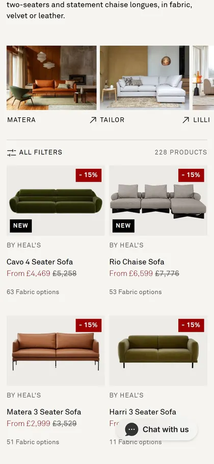
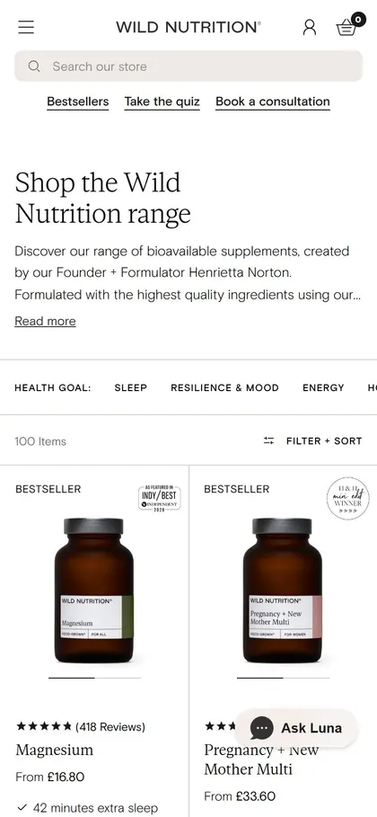
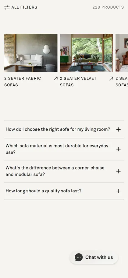
Want this on your store?
I'll tell you which of these patterns will move organic revenue for your catalogue, and which to skip.
Book a discovery call