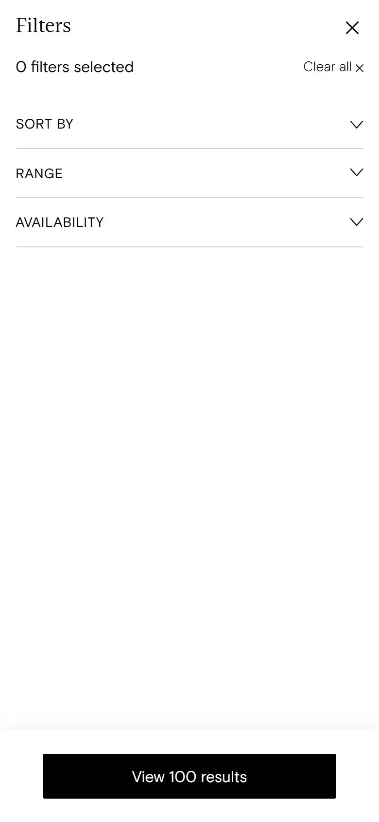
A filter menu that spends half its space on stock status
What they do
Open "Filter + Sort" on the all-supplements collection and the drawer has two filter groups. Range offers Children, Men, Teens and Women. Availability offers In stock and Out of stock. Below that there's only the sort order and a "View 100 results" button.
Why it holds them back
Availability takes up half the filter drawer and answers a question almost nobody asks. No customer wants to narrow a supplement range down to the things they can't buy, and an "Out of stock" option points people straight at the gaps. Meanwhile the filters that would actually help aren't there. The range comes as capsules, powders and gummies, some products are vegan, and customers care about both. Health goal, the thing this site does brilliantly everywhere else, is handled by the links above the grid but can't be combined with anything in the drawer.
What to do instead
Drop the Availability filter and push out-of-stock products to the bottom of the grid (or hide them) instead. Use the space for filters that change what a customer buys: format (capsule, powder, gummy), dietary (vegan), and health goal as a filter that combines with Range, so "women" plus "sleep" is one step. Check the site search and analytics for what people actually type before choosing which facets to add.
More like this
More collection patterns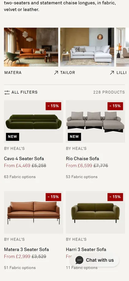
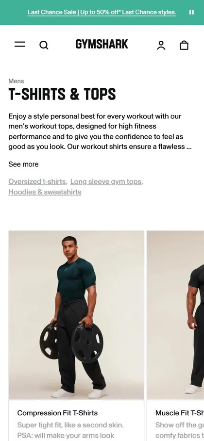
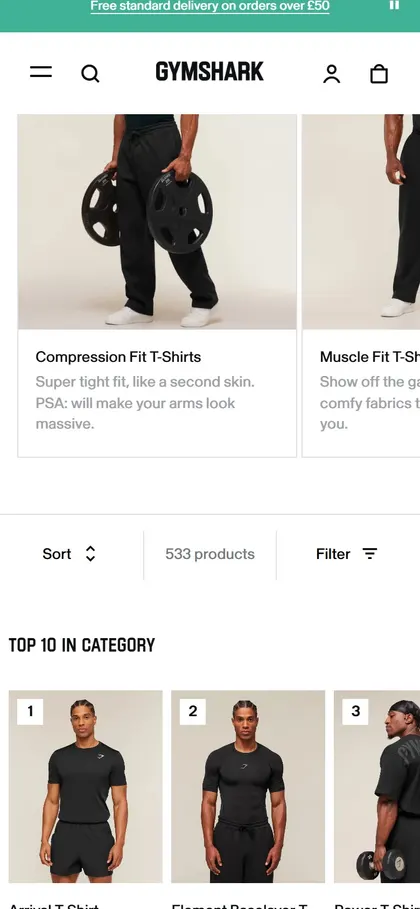
Want this on your store?
I'll tell you which of these patterns will move organic revenue for your catalogue, and which to skip.
Book a discovery call