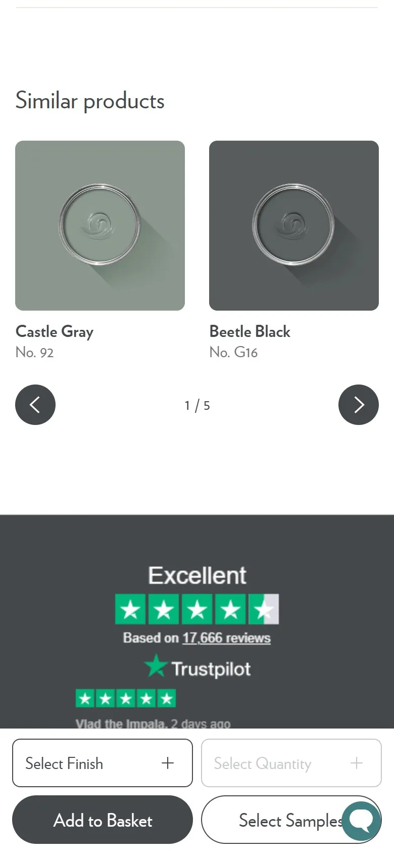
Similar alternatives kept separate from products that go with it
What they do
A Similar products carousel at the foot of the page offers ten alternatives to the shade, three pages deep, each as a sample pot in the colour with its name and number. On Douter they're the neighbouring greens and near-blacks: Plummett No.272, Paean Black No.294, Liquorice No.CB10, Grove Green No.G17, Chine Green No.35, Monkey Puzzle No.238, Castle Gray No.92. On Nancy's Blushes the same slot returns pinks and reds: Lake Red No.W92, Templeton Pink No.303, Middleton Pink No.245, Cinder Rose No.246, Rangwali No.296. It's deliberately a different job from the complementary white and the colour schemes higher up the page, which suggest what to put beside this colour rather than what to use instead of it.
Why it works
A shopper on a product page is in one of two states, either happy with the colour and wondering what goes with it, or not quite sure this is the one. Most sites merge those into a single "you may also like" row and serve neither. Splitting them means the person still deciding gets a shortlist of near neighbours without leaving the page, and the person who has decided isn't distracted by alternatives whilst they're being sold the scheme. Keeping the alternatives at the bottom and the pairings in the body is the right order, because it puts the doubt-resolving row after the persuasion rather than in the middle of it.
Makes sense when
Any catalogue deep enough that a shopper's first pick is rarely their final one, and where you already run a recommendations block. The change is mostly editorial: decide which slot answers "instead of" and which answers "along with", label them so the difference is visible, and stop one algorithm filling both.
More like this
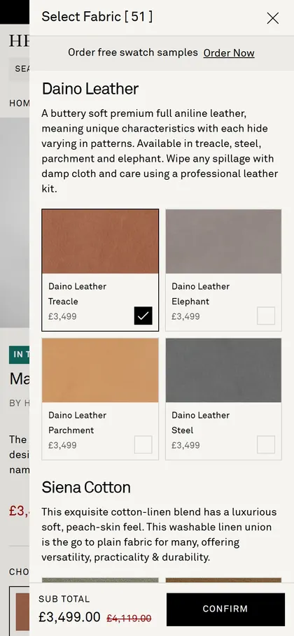
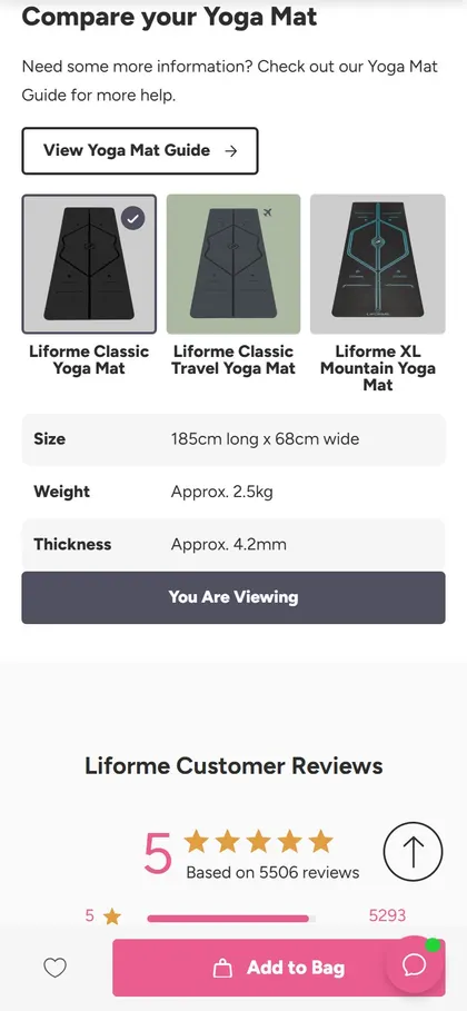
More product patterns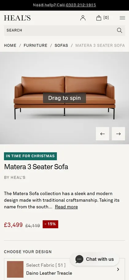
Want this on your store?
I'll tell you which of these patterns will move organic revenue for your catalogue, and which to skip.
Book a discovery call