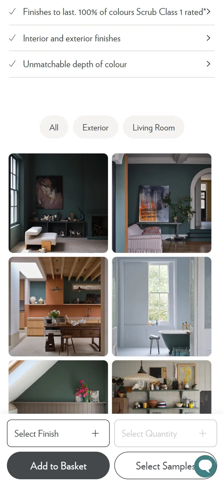
A gallery of the product in real rooms, filtered by room
What they do
Below the description sits a gallery of the colour in finished rooms, filtered by where it has been used. Douter carries eighteen images behind an All, Exterior and Living Room filter set, six at a time with a Load More that counts what is left. The filters are generated from whatever imagery exists for that colour rather than being a fixed set, so Nancy's Blushes offers nine: Bathroom, Bedroom, Child Room, Dining Room, Exterior, Hallway, Kitchen, Living Room and Nursery, across fifty-five images.
Why it works
Paint behaves differently on a north-facing bedroom wall and a south-facing front door, so "show me this colour" is really "show me this colour in my situation". Filtering by room answers that question directly instead of making the shopper scroll a mixed grid hoping something matches. Loading six at a time keeps the page quick whilst the counter signals there's plenty more to see, which is a better prompt than an endless scroll that hides its own depth. The images also carry weight a swatch cannot, because a photograph of someone's finished hallway is proof that the colour survives contact with a real house.
Makes sense when
The product's appearance changes with context, and you have or can gather imagery showing it in use. Filters should be built from tags on the images rather than hard-coded, or half of them come back empty as the library grows. A gallery with four photos and six filters looks worse than four photos and none.
More like this
More product patterns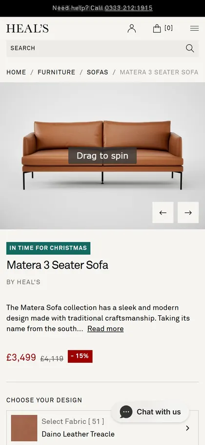
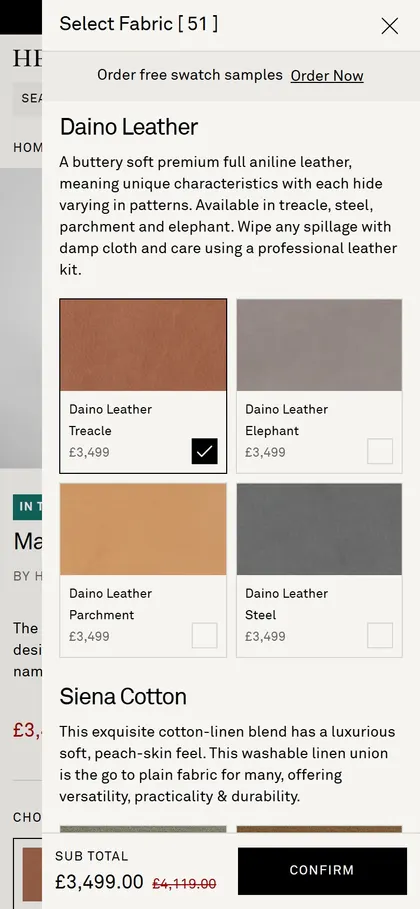
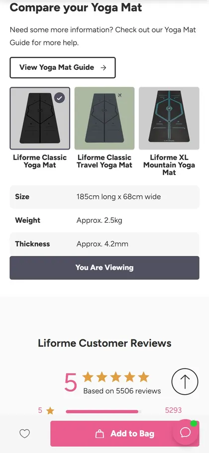
Want this on your store?
I'll tell you which of these patterns will move organic revenue for your catalogue, and which to skip.
Book a discovery call