A product quiz link in the main navigation
What they do
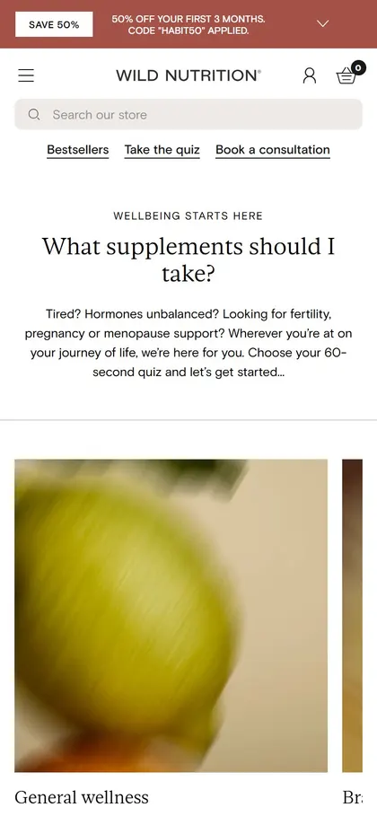
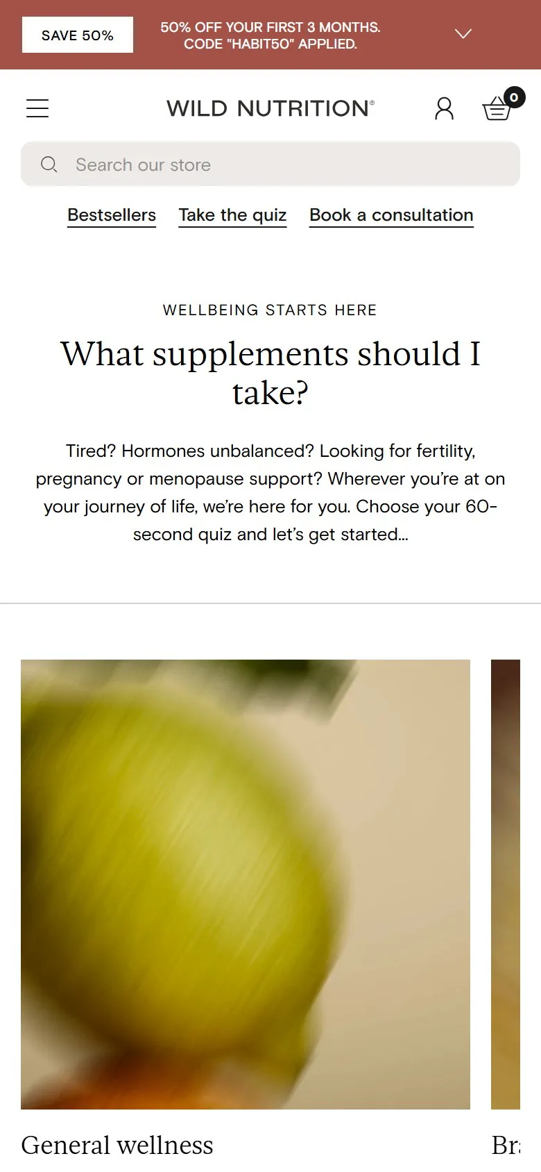
"Take the quiz" is the second item in the desktop header, straight after Shop, and one of three shortcuts under the search bar on mobile (Bestsellers, Take the quiz, Book a consultation). It opens a hub headed "What supplements should I take?" offering seven 60-second quizzes: General wellness, Brain Health, Weight Management, Fertility, Pregnancy, Perimenopause and Menopause. The brain health one is four questions long. The quiz turns up again in the homepage consultation block and as a tile inside the collection grid.
Why it works
With around 100 supplements in the range, most first-time visitors aren't asking "where's the magnesium", they're asking "what should I actually be taking". The quiz is the answer to that question, so putting it in the navigation treats it as a way to shop rather than a marketing extra. Splitting it by life stage keeps each quiz short and makes the questions feel relevant, which a single catch-all quiz covering fertility and menopause couldn't do.
Makes sense when
Any catalogue where the customer's real question is "which one is right for me": supplements, skincare, coffee, mattresses, running shoes. It only earns a nav slot if the recommendation logic behind it is good (Wild Nutrition run theirs on Octane AI) and someone keeps the product mapping up to date as the range changes.
Want this on your store?
I'll tell you which of these patterns will move organic revenue for your catalogue, and which to skip.
Book a discovery call