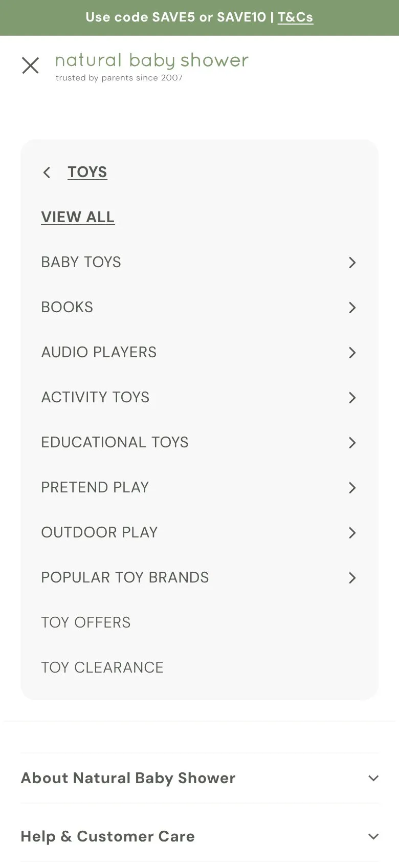
A big mega menu that's packed tight on desktop and tablet
What they do
Hover over Toys and you get 45 links in tight columns, each 20px tall in small text. Lots of options is good, but they're close together. On a phone it's fine, a drill-down with proper 44px rows. The cramped version is desktop, and that's what most tablets get too.
Why it holds them back
A 20px link is less than half the size usually recommended for something you tap, so on a touchscreen it's easy to hit the one next to it. Anything 820px wide or more gets this menu, which covers an iPad held either way round, apart from the smallest models in portrait.
What to do instead
Give the rows more room, nearer 32px each, with slightly bigger text. If that makes the panel too long, trim each column to the most-used links and let "View all" cover the rest.

Want this on your store?
I'll tell you which of these patterns will move organic revenue for your catalogue, and which to skip.
Book a discovery call