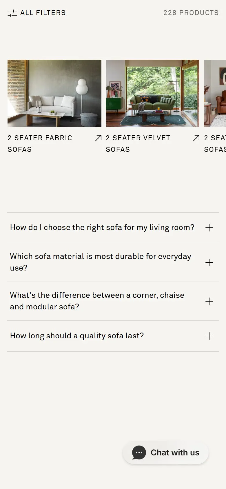
A carousel of related sub-categories below the grid
What they do
Under the grid, a second carousel repeats the visual treatment of the range carousel at the top of the page, but the cards are filter combinations rather than ranges: 2 Seater Fabric Sofas, 2 Seater Velvet Sofas, 2 Seater Leather Sofas, 2 Seater Sofas, 3 Seater Fabric Sofas, 3 Seater Velvet Sofas. Each is a lifestyle photograph linking to its own /collections/ URL, not to a filtered version of this page.
Why it works
These are the phrases people type. Size plus material is how a sofa search actually gets worded, and building each combination as a real collection gives it a crawlable, linkable, rankable page instead of a query string Google will ignore. Placing the carousel below the grid catches the shopper who has scrolled 246 products and still not narrowed, and hands them the narrowing they were about to do by hand. Same component as the top carousel, different job, which keeps the page feeling designed rather than bolted together.
Makes sense when
Catalogues with two or three attributes that shoppers combine naturally, and enough stock that each combination holds a respectable page. The trap is generating every permutation: a sub-collection with four products in it is thin, competes with its parent and adds nothing but crawl. Build the combinations that have search demand behind them, check they aren't cannibalising the parent category, and leave the rest as filters.
More like this
More collection patterns

Want this on your store?
I'll tell you which of these patterns will move organic revenue for your catalogue, and which to skip.
Book a discovery call