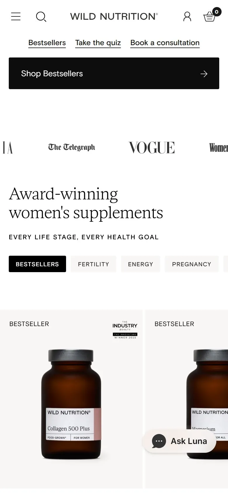
Press logos straight under the homepage hero
What they do
Immediately under the "Return to rhythm. Feel the difference" hero, a slim ticker scrolls the logos of Grazia, The Telegraph, Vogue and Women's Health on a loop. The row after it is the bestsellers carousel, where several product cards carry award badges in the corner (Indy Best among them), and a rating strip says "Loved by 300,000+ customers".
Why it works
A first-time visitor on a supplements site is deciding whether the brand is legitimate before they look at a single product, and borrowed authority from titles they already trust answers that in one glance. The ticker costs one short row, so it doesn't push the products down, and the award badges carry the same signal into the product cards where the buying actually starts.
Makes sense when
Any brand with genuine coverage in titles its customers read. Only use logos where the coverage was real and recent, and keep the numbers consistent: this homepage says "300,000+ customers" near the top and "430,000+" further down, which is the sort of thing a sceptical visitor notices.
More like this
More homepage patterns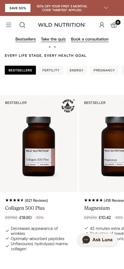
Want this on your store?
I'll tell you which of these patterns will move organic revenue for your catalogue, and which to skip.
Book a discovery call