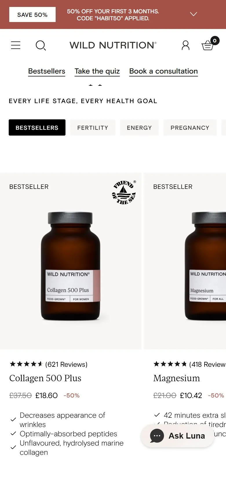
Homepage bestsellers you can filter by customer goal
What they do
The first product row on the homepage, "Every life stage, every health goal", carries thirteen tabs: Bestsellers, Fertility, Energy, Pregnancy, Hormones, Brain Health, Gut Health, Sleep, Perimenopause, Beauty, Stress, Immunity and Menopause. Clicking one swaps the carousel in place, with no page load: Fertility brings up Fertility Support for Women, Fertility Support for Men and the Women's Fertility Duo; Brain Health brings up Lion's Mane Plus and two brain duos. Further down the page, the reviews carousel has its own set of goal tabs, so the testimonials filter the same way.
Why it works
Customers don't think in ingredients, they think in problems: "I can't sleep", not "I need magnesium". Organising the homepage shelf by goal lets a visitor narrow the range to their problem in one tap, from the homepage, without committing to a collection page. Filtering the reviews by the same goals means the social proof a customer reads is about their problem too.
Makes sense when
Any range that splits naturally by need or occasion: supplements, skincare, pet food, gifting. Only add a tab you can fill with at least three products, otherwise it looks like a gap rather than a shortcut.
More like this
More homepage patterns
Want this on your store?
I'll tell you which of these patterns will move organic revenue for your catalogue, and which to skip.
Book a discovery call