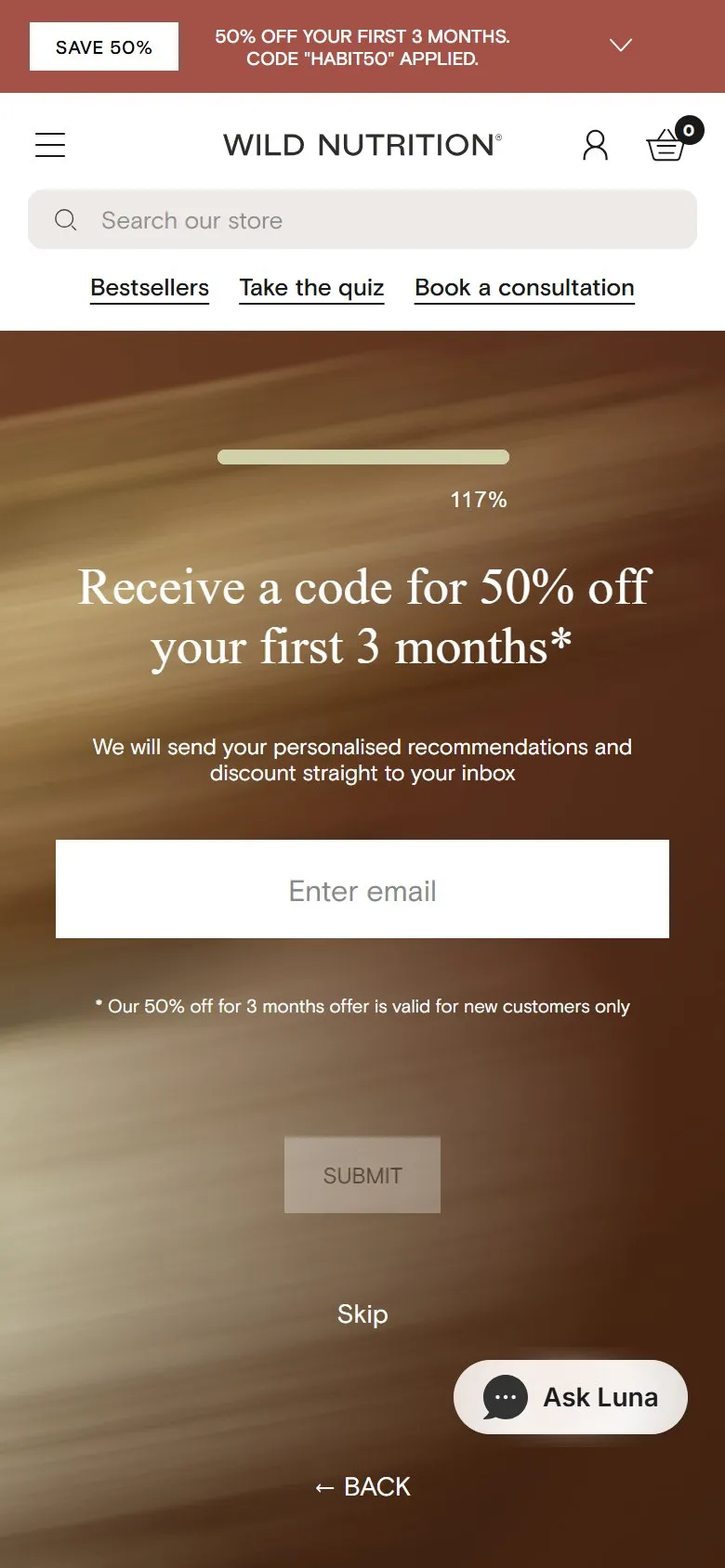
An optional email sign-up at the end of the quiz
What they do
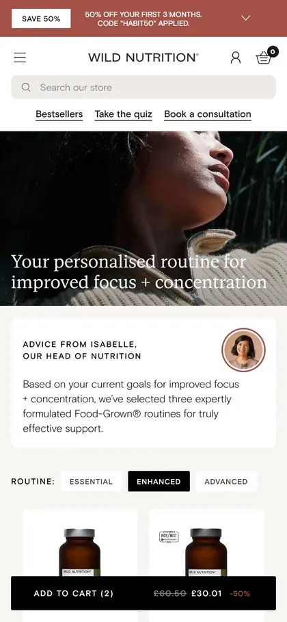
The last screen before the results is "Receive a code for 50% off your first 3 months*", with one email field and the line "We will send your personalised recommendations and discount straight to your inbox". The asterisk says the offer is for new customers only. Under the Submit button is a plain "Skip" link, and skipping goes straight to the results page with the standard 20% subscription saving rather than the 50%.
Why it works
The ask lands at the point of highest investment: the customer has answered every question and wants their answer, so the email feels like a small step to get it rather than a toll. The offer gives two reasons at once (the results in your inbox and a discount worth having), and the Skip link keeps it honest, because nobody's results are held hostage. The real value is on Wild Nutrition's side: every address that comes in is tagged with a stated health goal, which makes the follow-up emails far more relevant than anything a generic newsletter sign-up can send.
Makes sense when
Any product quiz. Never gate the results behind the email, and pick an incentive the margin can carry. 50% off for three months works on a subscription with a long customer lifetime; on a one-off purchase a smaller discount or free delivery does the same job.
More like this
More quiz patterns
Want this on your store?
I'll tell you which of these patterns will move organic revenue for your catalogue, and which to skip.
Book a discovery call