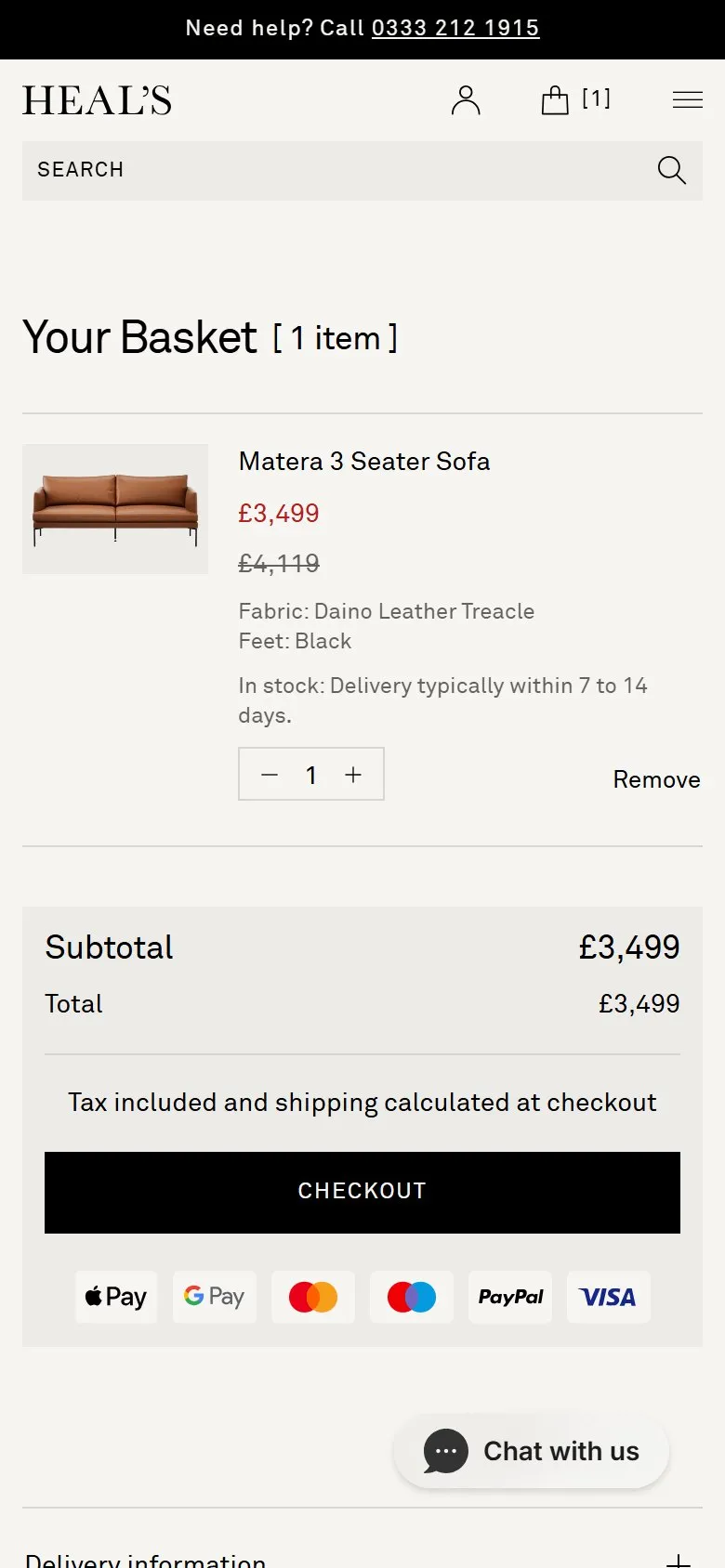
A high-value basket with no cross-sells or add-ons
What they do
Configure the sofa, add it, and nothing between there and payment offers anything to go with it. The product page's "You may also like" carousel runs ten products and every one of them is a Matera: the 4 seater, the 2 seater, both chaise sofas, the corner, the bed, the bench, the ottoman, the armchair and the chaise lounge. Half of those are the sizes the shopper has just rejected. The basket page is one line item, a subtotal, a checkout button and three information accordions, with the left two thirds of the row empty. Checkout is a stock one-page Shopify form. No cushions, no throw, no fabric protection, no care kit, no rug, no delivery upgrade, at any step.
Why it holds them back
The recommendation slot is filled by a collection rule rather than by merchandising, so it lists the range and calls it a recommendation. The ottoman and the armchair genuinely belong next to a three-seater; they're buried in a carousel alongside the four sizes the shopper has just turned down, which is what a rule produces and a merchandiser wouldn't. Meanwhile the accessories that would genuinely go with the sofa are being shown to them anyway, in the lifestyle photography further up the same page, styled with cushions, throws and side tables Heal's sells and doesn't link to. That's the miss: not that the cross-sell is weak, but that the merchandising already exists as a photograph and stops short of being shoppable. On a £4,119 order a £60 cushion is a rounding error to the customer and pure margin to the retailer, and the moment to ask is whilst they're picking a fabric, not in an email three weeks later.
What to do instead
Read this one as the diagnostic rather than the pattern. Where a product page's recommendations are all siblings of the thing on screen, the slot is being filled by a collection rule rather than by merchandising, and it's worth checking what the room shots are wearing. Two fixes in order of effort: link the styled products under the lifestyle images, either as hotspots or as a shop-the-look row, which the Liforme hotspot and add-on entries in this board both cover; and add one relevant add-on at the basket, not a carousel of them. The failure mode in the other direction is a checkout stuffed with offers, which costs more conversions than it wins on a considered purchase.
Want this on your store?
I'll tell you which of these patterns will move organic revenue for your catalogue, and which to skip.
Book a discovery call